Accessibility
I sell accessible websites, so this page needs to be checkable rather than reassuring. Here's what's true about this site today, how I know, and what I haven't done.
Where it stands
This site aims at WCAG 2.2 Level AA. Every public page — this one, the home page, contact, privacy, terms, sign in and sign up — currently reports zero violations from an automated audit run in both the light and the dark theme, including the rules that are stricter than the standard requires.
Automated testing catches maybe a third of what matters. The rest of this page is the part a tool can't check.
What works
- A skip link, first in the tab order
- Press Tab on any page and the first thing you get is "Skip to main content". It moves focus, not just the scroll position, so the next Tab lands in the content instead of back in the menu.
- Named landmarks
- Every page has one main landmark, a banner, a named "Main" navigation and a named "Footer navigation", so jumping by landmark tells you where you are going rather than announcing "navigation" twice.
- Headings that describe the page
- One h1 per page and no skipped levels. The outline is the page — you can read it by headings alone and know what is here.
- Visible focus on everything
- Every link, button and field draws a focus ring that clears 3:1 against what is behind it, on both the dark and the cream ground. Nothing is reachable without being visible.
- Links you can find without seeing colour
- Links in text are underlined all the time, not on hover. Hover doesn't exist for a keyboard, a screen reader or a touchscreen, so an underline that only shows on hover isn't one.
- Contrast checked by a script, not by eye
- Both themes are validated against WCAG AA by a check that runs with the tests. Text on the cream ground measures 14.8:1, the green that carries links 5.8:1, and on the dark ground 17:1 and 7.8:1.
- Motion only if you want it
- The background and one heading move, and both stop dead if your system asks for reduced motion. Nothing autoplays, nothing flashes.
- It works zoomed and it works small
- The layout reflows to one column at 320px and at 400% zoom, with no sideways scrolling and nothing cut off. Text sizes are relative, so your own font setting is respected.
- The images say something useful
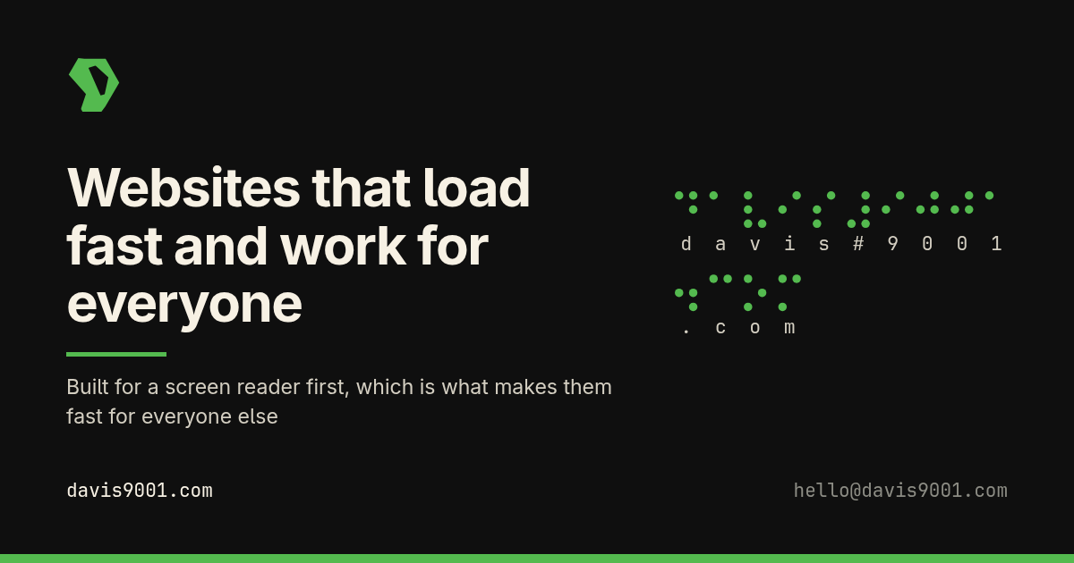
- The Braille on the front page is marked up as an image whose description is what it says, not "decorative dots". Purely decorative marks are hidden from screen readers instead of being announced.
What is not done
- No blind or low-vision person has tested this site yet. Everything above is a developer with a screen reader and an audit tool, which is not the same thing. I would rather say that than let you assume otherwise.
- The administration area behind the login has not been audited to the same standard. It is not public, but it is the part a client would use to run their own site, so it matters and it is next.
- Only English is declared and only English is written.
- The statement has not been through a formal third-party accessibility audit.
The same claims, on every element
Headings, labels, focus and status messages are easier to check than to read about. What follows is every element a website is made of, built the way it should be, with a note on what the usual trap is. Try it with a keyboard: Tab forward, Shift+Tab back, and nothing here is reachable without being visible.
Headings
One h1 per page, and no level skipped. The outline is how a screen reader user navigates — most jump by heading rather than reading top to bottom — so a heading chosen for its size rather than its rank breaks the map of the page.
Heading level 3
Heading level 4
Heading level 5
Heading level 6
Text
The semantic elements, used for meaning rather than for looks. <strong> is importance and <b> is only bold; a screen reader can act on the first and
has nothing to say about the second.
A paragraph with strong importance, stressed emphasis, a highlighted run, deleted text and inserted text.
Technical bits: inline code, a Ctrl + K shortcut, sample
output exit 0, a variable n, water is H2O and the area is
10m2.
An WCAG abbreviation carries its
expansion, a short quotation
gets its own marks from the browser, and is machine-readable.
David MonaghanThe power of the Web is in its universality. Access by everyone regardless of disability is an essential aspect.
[email protected]
+1 (602) 299-2243
// a preformatted block scrolls sideways
// rather than dragging the page with it
const ratio = contrast('#54BA4F', '#0F0F0F'); // 7.3
Lists
A real list tells a screen reader how many items there are before it starts reading them. A stack of divs does not, so the listener has no idea how long they are in for.
Unordered
- A first item
- A second, with children
- Nested one
- Nested two
- A third item
Ordered
- Point a domain at it
- Sign in and change the words
- Tell people it exists
Description
- Care plan
- $9 a month. Not hosting.
- Floor
- $100, and you pick anything above it.
Links
Link text has to make sense read on its own, because screen reader users often pull up a list of every link on the page with no surrounding sentence. “Click here” in that list is twelve identical rows. Links in prose are underlined, not colour-only.
An internal link to the accessibility statement, an external link to the WCAG 2.2 quick reference(opens in a new tab), and a download of the share card.
A link that has been visited, one being hovered and one holding focus all look different from each other, and none of them rely on colour alone to say so.
Tables
A caption says what the table is before anybody reads a cell, and scope tells a screen reader which header belongs to which cell — without it, the ninth
number in a row is just a number.
| Kind of change | Usual price | Example |
|---|---|---|
| Small edits | Free while subscribed | Opening hours, a phone number |
| Real content | $15–40 | A new page, written and built to match |
| Something that does a job | $40–200 | Online booking, a quote calculator |
| Whole application | $2,000 and up — quoted and agreed before anything starts | |
The wrapper is focusable on purpose: a table that scrolls sideways has to be reachable by keyboard, or the columns off the edge are unreachable without a mouse.
Images
Alt text describes what the image is for, not what is in it. A decorative image takes alt="" so it is skipped entirely — an empty alt is a decision, a missing one makes
the screen reader read the file name out loud.
role="img" and a label that says the values.Media
Nothing autoplays, everything has controls a keyboard can reach, and anything with speech in it ships captions. Audio that starts on its own is the single most hostile thing a page can do to a screen reader user — it plays straight over the voice they are listening to.
No recorded media ships on this site yet. When it does, it arrives with a <track kind="captions"> and a transcript on the page — the transcript matters
as much as the captions, because it is the part a deafblind reader can use on a Braille display.
Forms
Every control has a real <label> tied to it, so tapping the words focuses
the field and a screen reader announces it. Hints are joined with aria-describedby, errors are announced and take focus, and autocomplete is set so a browser can fill in what it already knows.
Interactive
The browser's own elements, used rather than rebuilt. A <details> is keyboard
operable and announces its open state for free; a div with a click handler has to have all of that
put back by hand, and usually does not.
Is the care plan hosting?
No. Hosting is on an account in your name and at this size it costs nothing. The $9 buys the site being kept secured and up to date afterwards.
What happens if I stop paying?
Your site stays online. You would just be taking over the caretaking yourself.
Status messages
Something that changes on screen without a page load has to be announced, or a screen reader
user never learns it happened. role="status" waits politely for a gap; role="alert" interrupts, and is for things that genuinely cannot wait.
Press “Announce something” above.
Tell me when it is wrong
If something here stops you, I want to hear about it — including the small stuff nobody bothers reporting. Email [email protected] or call +1 (602) 299-2243.
I'll come back to you on whether I can fix it and when, and I won't ask you to prove it first.
Last reviewed 2026-09-20.